
CyberGrants | Event Search
Summary
I was tasked with making our Event Search, for users to find volunteer events with, more usable and intuitive.
I was part of the old implementation of Event Search that happened 4 years prior. Due to limited resources, the Development team at the time implemented a faceted search that they told me would be easy and they used a third party solution to get it started. I mocked up designs that played nice with this clunky sidebar of accordions with checkboxes, but I knew one day that I would be able to do this correctly, with the users finally being prioritized.
Old Design
Please Note: This was the intended design, however, our clients added customizations that ended up hurting the UX experience. When we saw broken styles, we tweaked the interface but I knew we could do better.
Challenges
- Factoring our complex event types. We had Recurring Events, Ongoing Events, and One Time Events. We also had events with shifts, events that are team based and individual based. It was a mess and needed to be simplified
- Sneaking in a Smart Search. I had been wanting to do this for years, and I finally got it into my prototype but I knew that there would be pushback due to our backend fragility.
- Working with the Product Manager who had her own ideas on how this should work. This usually is not a problem, but this particular Product Manager was concerned with ALL edge cases during the ideation phase and this was a learning experience for me in getting buy-in, even from the PM.
- Figuring exactly what the users wanted at different phases of the search. Information Architecture was key here.
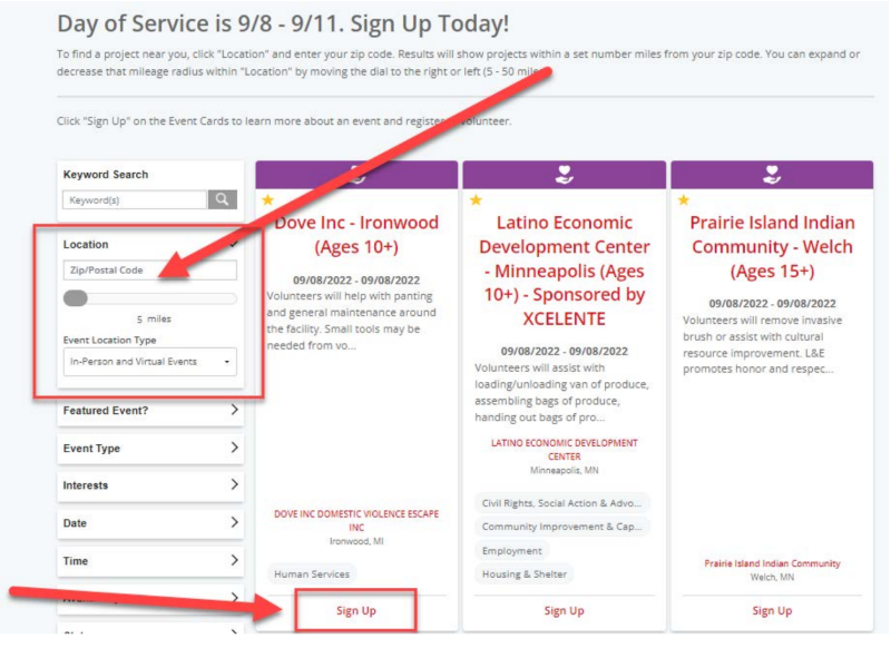
- Using the assumption of location to get users content immediately. For some reason, this was a tough sell because it was "expensive" and may not be accurate for all users to see events near them by default.
Process
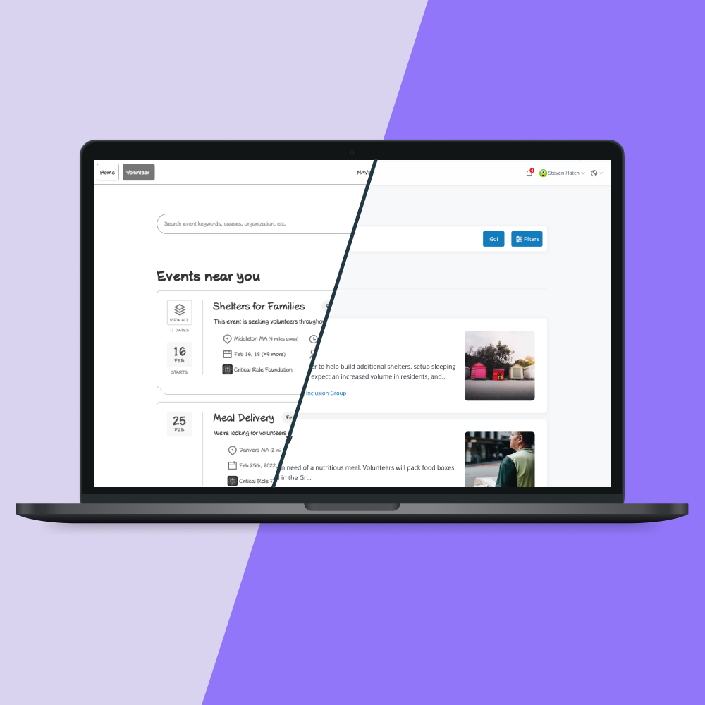
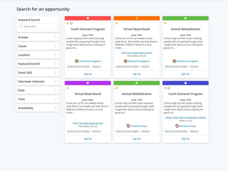
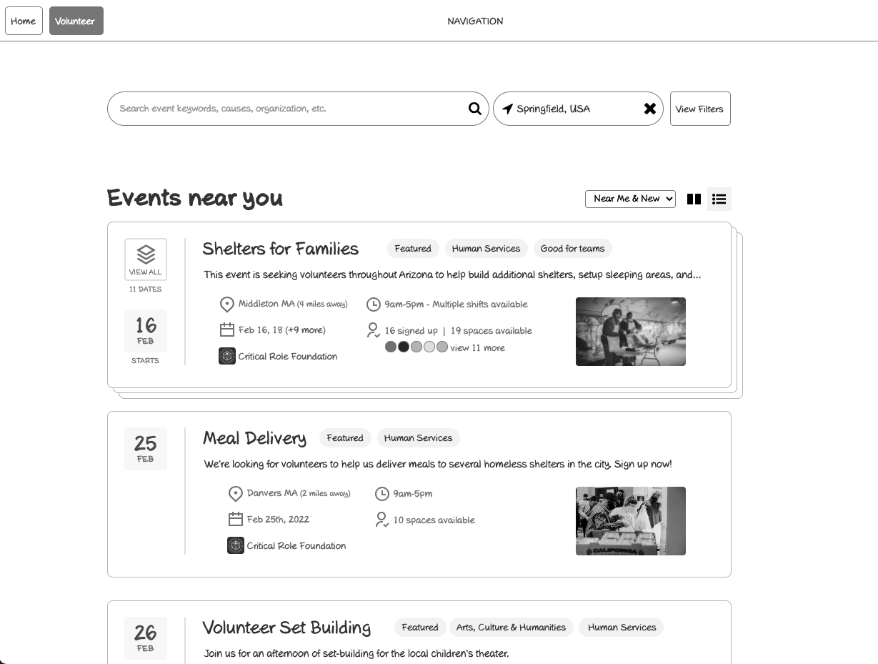
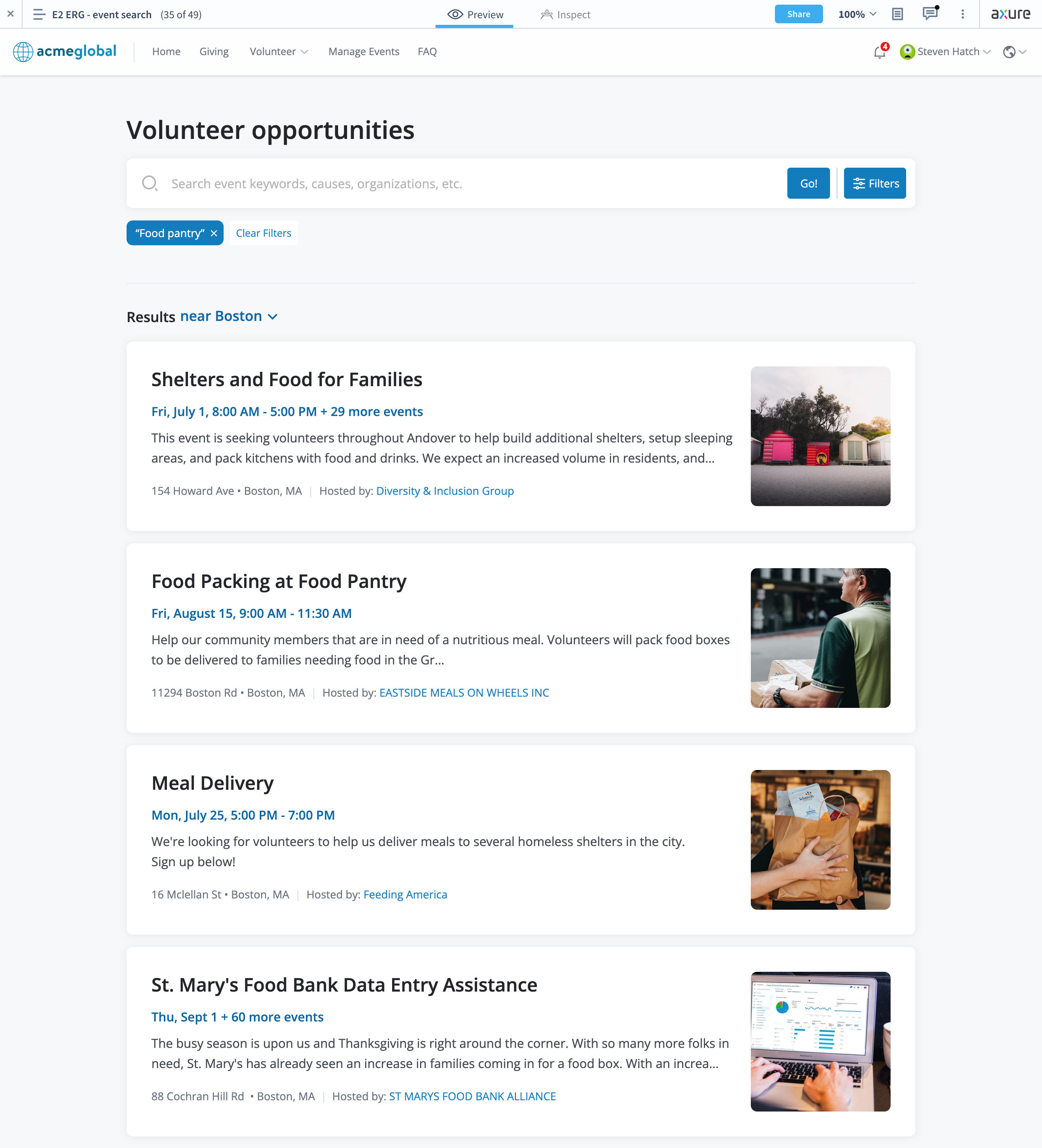
Above is a wireframe mockup. I created cards that consolidated events if they fell into an "ongoing" or "recurring" category. This removed the spamming of the same event on the results page. I researched best practices of result cards, competitive analysis, and filtering.
After going back and forth with the PM and Researcher, we were confident in doing an A/B test against our current solution. This went very well and we learned a ton from our first usability test.
--Then COVID hit and this project was shelved for about 2 years.--
When I got called on again to work on this project, I was happy as can be! I got all of my research and my wireframes, I looked at the results of our user testing and I was able to create one of the most successful usability tests in my career.
- I cleaned up the cards.
- I added a side-panel filtering interaction.
- I cleaned up the search bar area and put the location interaction in with the results title.
- Along with this, I created event landing pages that fit nicely when transitioning back and forth. The content that was pulled from the cards during cleanup was then displayed on these pages.
- Created workflows with form interactions and specific typing interactions that followed the script we created, in Axure.
Result
New event search tested very well and is still waiting for a Development Team to be assigned. Smart Search was prioritized ahead of everything else and was close to being ready when I left.